
THE WHO
Clayton Utz is one of Australia’s top-tier law firms, with a strong reputation for graduate recruitment. Their Early Careers division is a critical talent pipeline, connecting with university students and recent graduates across Australia. The firm needed to modernise this part of their website to better align with the expectations of a digital-native audience while supporting the HR team’s recruitment goals.
THE WHAT
Brief To Us
The client asked us to redesign the Early Careers section of their corporate website. The existing page was content-heavy, difficult to navigate on mobile, and failed to clearly guide users through the application process.
Our Understanding
I recognised this as more than a UI refresh; it was a key moment in the employer brand journey. The goal was to humanise the experience, remove friction, and build trust with student users, while ensuring the internal team could update content easily for future recruitment cycles.
THE HOW AND WHY
Discovery & Insight
I began by consulting with the HR and recruitment teams to understand their challenges and student pain points. Key issues included content density, lack of clarity around next steps, and minimal storytelling about life at the firm.
I mapped the end-to-end journey of a prospective applicant – from discovery (e.g. career fair or LinkedIn) to application submission – and identified what users needed at each stage. This helped me align design choices to real user behaviours.
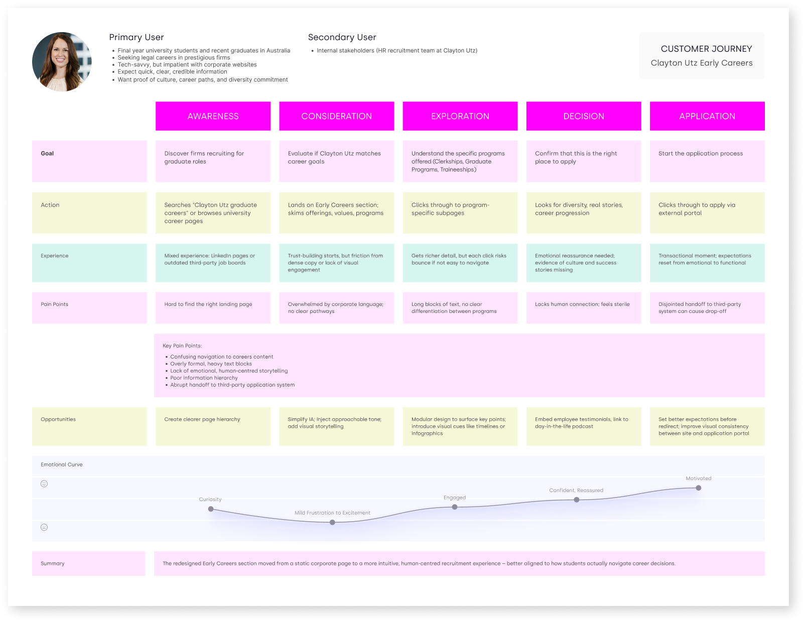
Experience Strategy
I restructured the content into clear, scannable sections, including:
- Why Clayton Utz?
- What programs are available?
- What’s the application process?
- Who thrives here?
I introduced graduate profiles, a visual application timeline, and flexible content modules to help tell a more human story while keeping navigation intuitive.
Execution & Design Rationale
While respecting the existing brand framework, I optimised the experience for mobile users, ensured accessibility compliance, and adopted a tone that felt relevant to younger audiences. The modular layout supported ongoing content updates, and every design decision was made to feel more inviting to students while maintaining the authority of a leading legal brand.
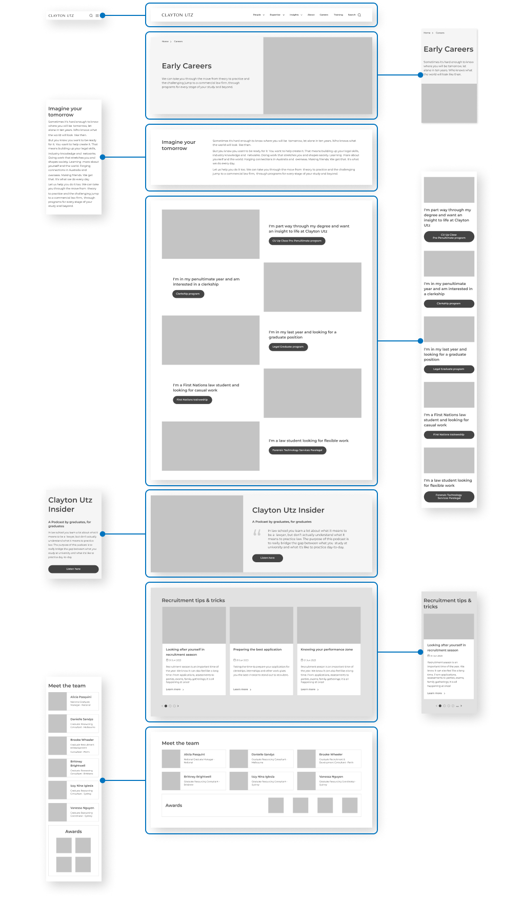
Mid-Fidelity Wireframe
This wireframe captures the proposed structure for the Early Careers program page, focusing on clarity, hierarchy, and user flow. Modular content blocks support scanability and mobile responsiveness, while the layout introduces visual signposts like a step-by-step timeline and expandable FAQs to reduce friction in the user journey.
THE RESULTS
The redesigned section delivered:
- Clearer navigation and structured content
- Better alignment with student expectations and browsing behaviour
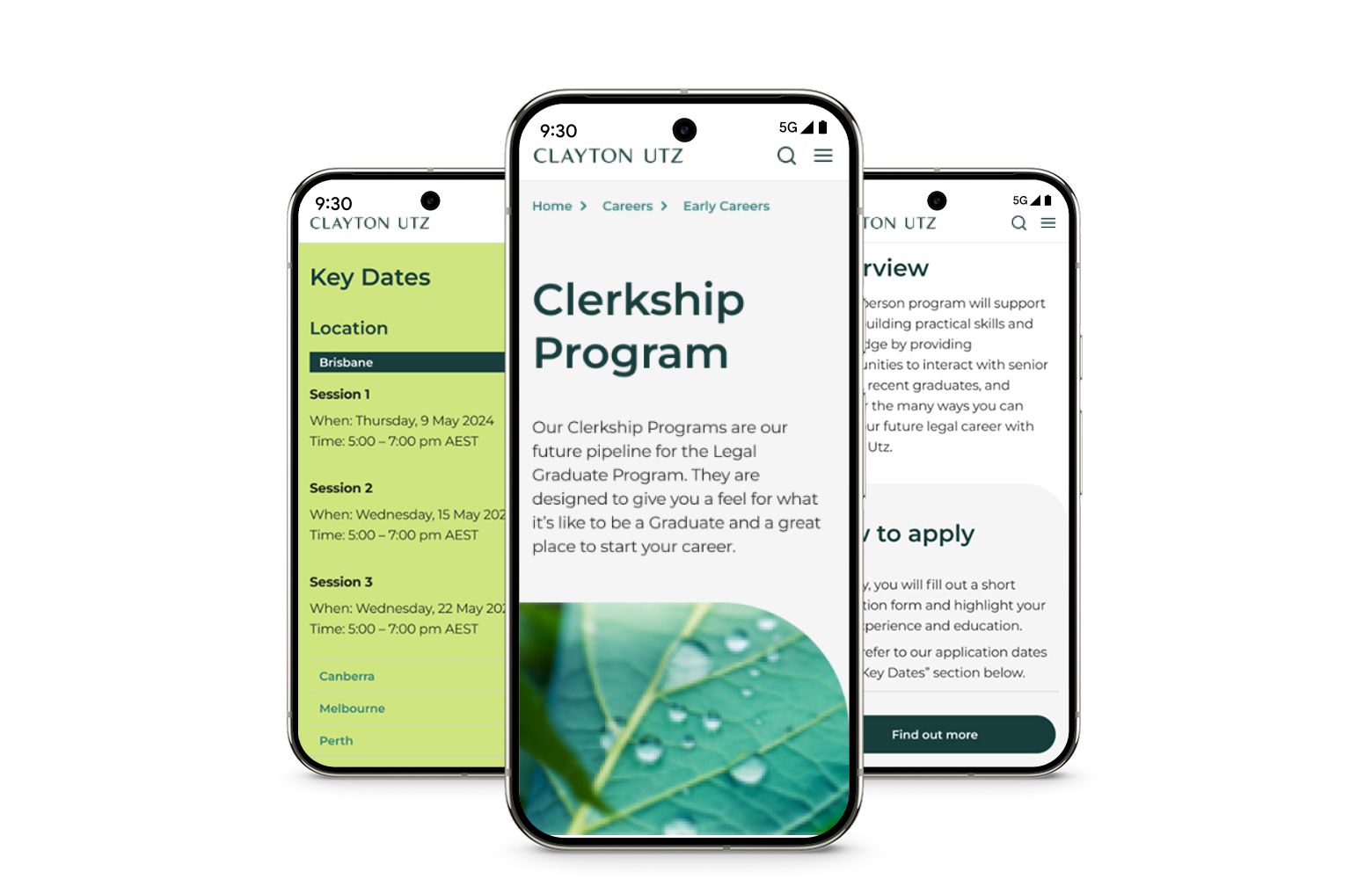
- A mobile-friendly, modular framework that allowed for easy internal updates
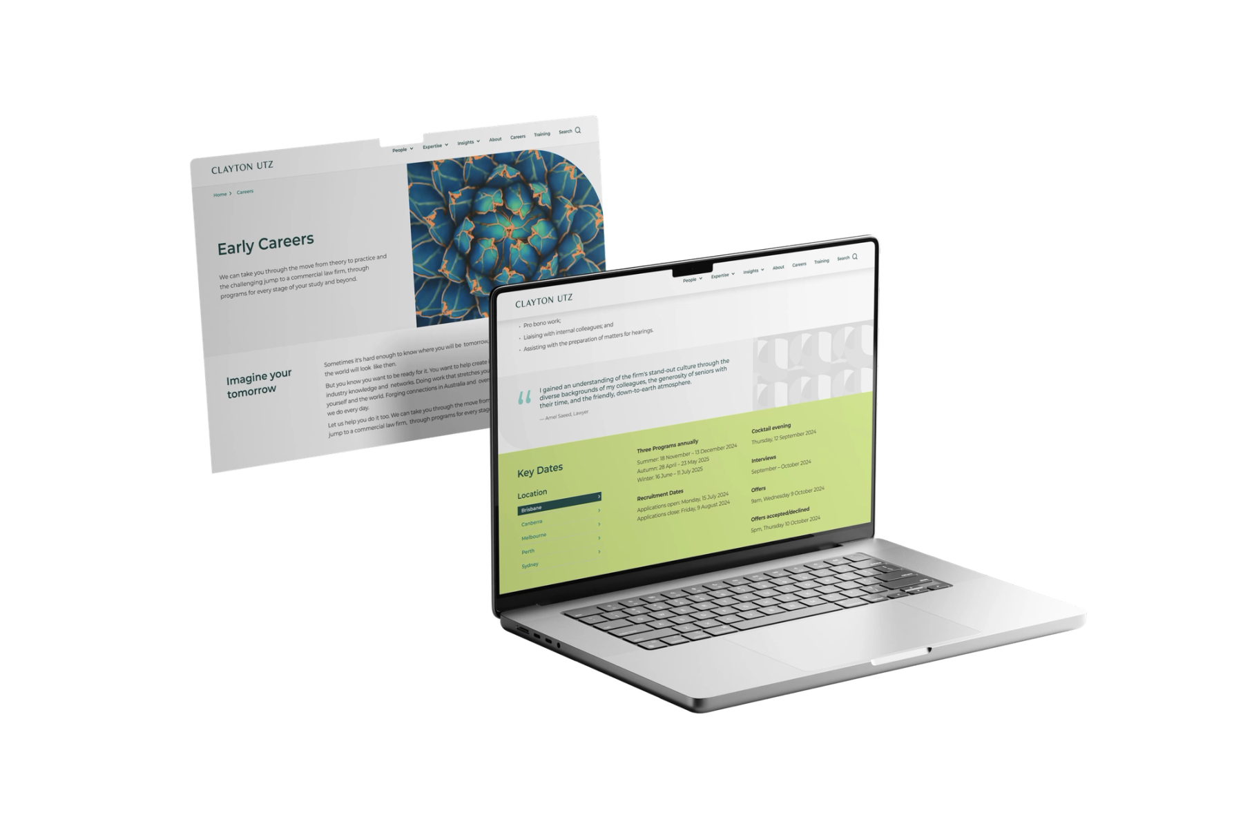
The new experience also served as a more engaging brand touchpoint, replacing static corporate messaging with a more human, story-led approach.
Learnings
Mapping the applicant journey early was key to aligning content priorities with real user needs. It provided a shared framework for decision-making and ensured that every design choice served a clear purpose.
The modular design system proved its value beyond launch. Flexible components allowed the HR team to update content seasonally without developer input, making the solution more sustainable over time.
The project reinforced that professionalism doesn’t require formality at the expense of personality. By introducing a more relatable tone and human voices through graduate profiles and clearer structure, engagement increased while staying true to the Clayton Utz brand.